Sunday, March 31, 2013

The Triangle Pose

 
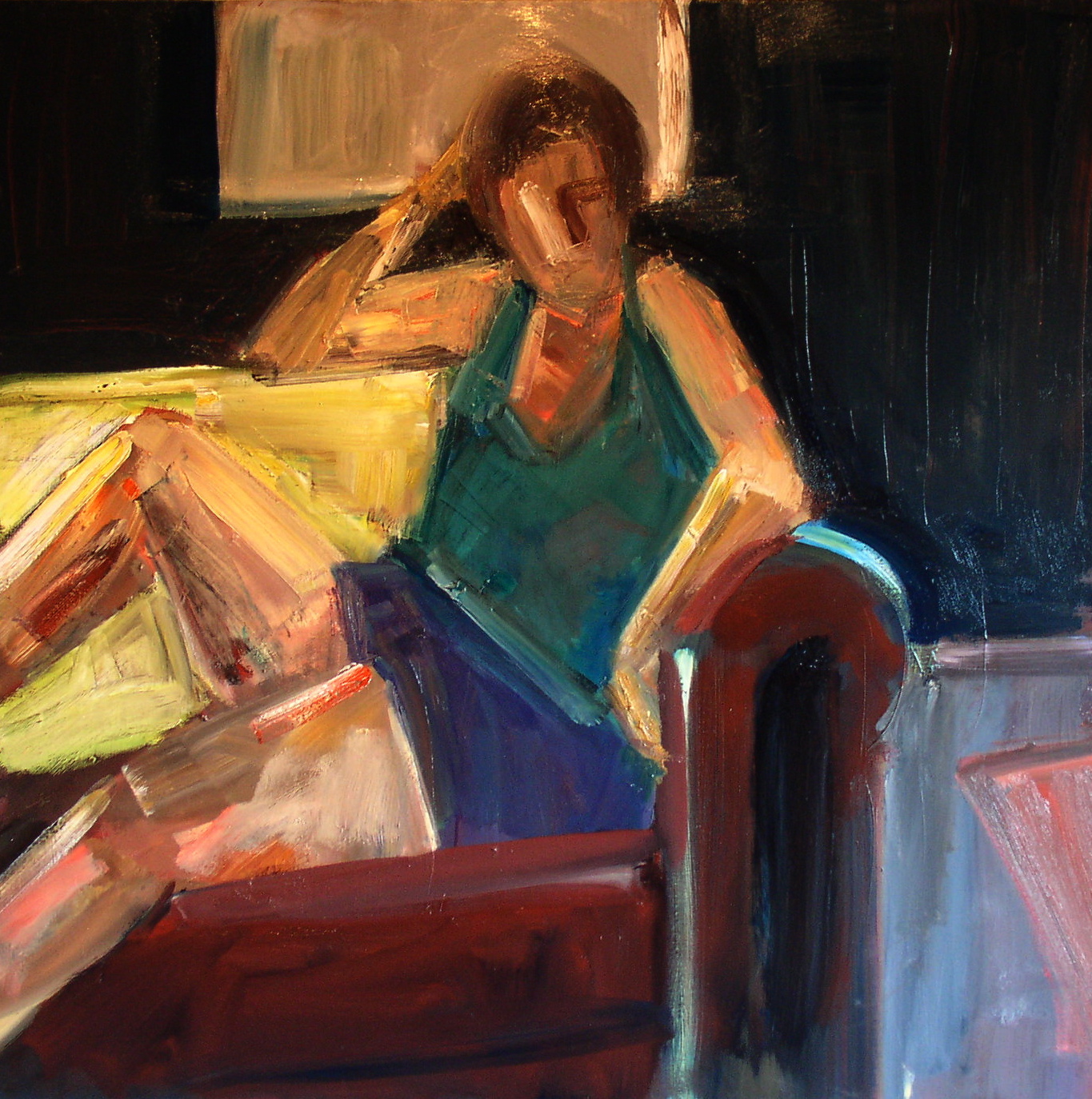
This painting started with a drawing from the model. During that session photographs were taken, and a second drawing was made from one of them . With these sources in hand, I began the work in paint.

Version 2 is not much more than a crude contour. By version 4, the weight of the pose is clearer as is the emotional distance of the figure. Even so, the color and surface of the painting remain rudimentary.


Triangle Pose-2


Triangle Pose-4


In version 6, most of the compositional elements of the painting are in place. I generally start with a strong color, either in gesso or oil, but this one began with a standard white canvas. For a while I thought I might keep the white dress, but I found it difficult to develop the rest of the color. I was drawn to the bluish-purple here as a better counterpoint to the skin tones.


Triangle Pose-6

 
Version 13  went as far as I could travel into the Land of the Decal. At this point the flatness became claustrophobic.  The surface quality, though actually thicker than it appears in the digital image, seemed slippery-slick. The eye doesn’t find a place to rest in this one and the movement isn’t circular; it’s side-to-side, top-to-bottom and off the edge.


Triangle Pose-13


In order to go forward, an important step back was taken in version 15. I had to undo many of the complicated and unsatisfying solutions I’d come to in #13 and lose what I could have called a finished painting. Some paintings don’t seem to need this kind of sharp U- turn, but here it turned out to be the right choice. 


Triangle Pose-15
  

The final painting includes evidence of all the wrong moves that led up to it. If I did manage to develop a depth of space, it’s in the simplified but still coalescing face. For me, it’s like a sculpture of smoke-- which, as energy-forms, we just might be.


"Triangle Pose"-oil on canvas, 48" x 48"

Thursday, February 28, 2013

"Wade In The Water"


There were eighteen versions of this painting, which is typical for one these larger canvases. In the first session, the mood was subdued & contained in spite of the gestural approach. I don’t usually start from white. I like to under-paint first with a dark or mid-tone to make the open areas easier to work through. Here I skipped that stage and white remained the dominant color for quite some time as the dress.


Wade In The Water-1


Making the leap to yellow was a nod to local color, but it also helped generate some basic structures that form the ground. By version 4 most of the composition is in place and the figure loses its demur quality, taking on a more assertive stance.


Wade In The Water-4


In version 6, I cut down the trees and also some of the value contrasts. The composition was diffuse at this point and the figure had lost its punch, which forced me to spend many days retracing my steps.

Wade In The Water-6


Eventually, I was able to steer the painting back in a  interesting direction.(Reinstating the trees helped). Even so, the figure remained awkward and the cartoon color- combinations were driving me crazy. I like to think of version 11 as “Attack Of The 50-Foot Hairdo.”


Wade In The Water-11


I include version 15 to illustrate how many things you need to change in order to move a painting from “close” to completed.  I’d felt all along that the key to the figure was to let the dress be the skin and the skin the dress, without making them entirely interchangeable. As a guiding principle, this is about as confused as you can get.


Wade In The Water-15


In the final painting, the majority of energy is in the “drapery” of the flesh and fabric, while the preponderance of mystery-- the necessary stillness--remains in the posture and face.


"Wade In The Water"-oil on canvas, 48" x 36"

Thursday, January 31, 2013

3 TIME TRAVELERS


These three paintings, all 24" x 24", were begun several years ago, and each was given a single day’s work. They were studio starts, painted from the model, but all the settings were invented. Even the set-up for “Barbara In Her Studio” is a travesty. There was no window behind the model, and the curved couch was, in reality, a rectilinear pink bench.

After the initial session, the paintings sat unfinished until this month. They were taken up again as stop-gaps, to give me something to work on while I allowed two larger paintings time to dry. After a few days, the smaller paintings took over and became the focus of my attention.

Instead of a feeling of distance, the long stretch between initial image-making and revision led to a sense of continuity  for me. The paintings themselves make their own time.
………………………………………………………………………

The difference between the first and last version of “Barbara In Her Studio” is the difference between a portrait (albeit a clumsy start ) and the painting of a figure in an interior. The initial image does have more of the model’s personality, but the room surrounding her comes across as a framing device. What I wanted in the final painting was an expression of the figure from the setting itself.


Barbara In Her Studio-Version 1


"Barbara In Her Studio"-oil on canvas, 24" x 24"


Version 1 of  "Green Dress" and the final painting seem like two different species, but if you look closely, there are several intersecting points. The pose has shifted, but some elements remain in spirit; the raised arm is now the left arm, and the “Saturday Night Fever” stance has been translated into an after-the-dance drinking song. (Or maybe she’s just doing The Limbo). These two images reverse the process of “Barbara In Her Studio.” What started as a figure in an interior turns into a raw form of portraiture.


Green Dress-Version 1


"Green Dress"-oil on canvas, 24" x 24"


“ Nude Near Water” retained its dreamlike quality from first to last. In spite of the title, the setting remains ambiguous; wherever the chair is perched is as much a state of mind as it is a precarious space. The digital image doesn’t convey the thickness of the paint. Here, the color-shifts are meant to render emotionally correct flesh, in the figure as well as in the water’s skin.

I’ve spent a long time looking at this one, and though I’m done with it, it feels like I’m still painting it. It’s important to me to craft the object, but at another level I just want to remain there, in the process of painting.


Nude Near Water-Version 1


"Nude Near Water"-oil on canvas, 24" x 24"

Monday, December 31, 2012

LUCKY 13


                                                                                                January 1, 2013

On the calendar page, jailed numbers are forced to do time. In a painting, time stretches out, and light on a face can last for centuries. Artemisia Gentileschi was able to achieve this, as others have before and since. 

The paintings included here all had other incarnations: they were started, then set aside, and then re-started after a lapse of time. In contrast, the drawings spiraled-out from a single point, over minutes or hours, in a single day.

Please note that the last of these drawings, “Leaflin In a Wool Cap,” will be included in the exhibition, “The Drawing Salon” at the Eloise Pickard Smith Gallery, UC Santa Cruz,  January 20-March 10.  There will be a reception on Sunday, February 10, from 3-5. I hope to see you there.

Happy New Year!


"In Red & Black"-oil on canvas, 24" x 20"


"Eduardo, Drawing"-colored pencil on paper, 12" x 9"


"Hieratic Robe"-oil on canvas, 48" x 36"


"Dancing Child"-colored pencil on paper, 12" x 9"


"Pink Cake"- oil on canvas, 24" x 24"


"Leaflin In A Wool Cap"-charcoal, tempera & acrylic on paper, 26" x 20"

Friday, November 30, 2012

"Purple Skirt" : The Evolution Of An Image


The source for “Purple Skirt” was first a sketchbook drawing  and then a 10” x 8” acrylic study. The awkward, intricate geometry of the image continued to hold my interest; but it took several years to get back to it, to extend it into a larger and, hopefully, more complex  painting.

Version 4, as purely flat as it is, sets the basic composition. Here I leaned heavily on contrasts between the Venetian red gesso and the ochre and yellow in the figure and window-frame. This was the basic-research part of the painting.


Purple Skirt-4


Version 7 was a start on the ambiguous and atmospheric quality of the final painting, especially the treatment of the head.


Purple Skirt-7


I could have continued in the direction the painting took in version 9. Here the weight and posture of the figure fall in a natural manner.  I had to leave these attributes aside in order to get the surface quality that became my central concern.


Purple Skirt-9


In version 10, the lemon yellow of the couch-back gave me an idea of how to build the color. I eliminated the yellow in later versions (there ended up being a dozen more variations), but I did keep the paint-handling the color had suggested.


Purple Skirt-10


When I was done with version 12, I had most of the basic elements in place, but a long, hard slog was necessary to reach the finish-line.


Purple Skirt-12


The final painting has the kind of surface physicality that I’m fixated on. It’s what I’ve been calling, "saturated transparency," for lack of a better term. I hope I can carry it through to future paintings.

"Purple Skirt"-oil on canvas,  36" x 36

Wednesday, October 31, 2012

October Drawings & Paintings

 
It’s been a productive month for me, with three new large paintings started and one completed, a dozen paintings on paper and a sketchbook full of drawings. The interaction between drawing and painting continues to unfold in ways that are still unpredictable to me. 


"Maria-Purple Dress 1"--9'' x 13" acrylic on paper


"Laptop"--12" x 16" colored pencil on paper


"Halter Top"--18" x 16" pastel, charcoal & tempera on paper


"Street Viewers"--12" x 9" colored pencil on paper


"The Shawl Backdrop"--16" x 12" tempera & gesso on canvas


"Short Coat"--12" x 9" colored pencil on paper


"White Dreadlocks'--12" x 9" pencil & charcoal on paper


"Skeptical"--12" x 9" colored pencil on paper


"Man With A Noble Nose"--10" x 7" pencil on paper


"Maria-Purple Dress 2"--13" x 9" acrylic on paper


"Nude On A Couch"--18" x 16" mixed media on paper


"Leaflin"--36" x36" oil on canvas

Sunday, September 30, 2012


STUDIES


I have been using drawings and color sketches as sources for larger paintings, but some of these studies never make the transition. I take them out to look at occasionally and think about the paintings I’ll do in the future—whenever that is. A few I return to over and over again. This is a selection from that group.


"Closed Pose"  12" x 9"  tempera & crayon on paper


"Leaflin With Her Necklace"  28" x 20" acrylic on paper


"Against White"  12" x 9" acrylic on paper


"Z  Pose"  28" x 20" acrylic on paper


"The Tattoo" 18" x 13" acrylic on paper


"Red Couch Nude"  13" x 14" acrylic on paper