Friday, August 30, 2013

The Road To Simplify

 
This is the second in a pair of male bathers, both of which began from photographs and drawings.  It shows an older man, seen from above, with fragments of secondary figures extending off the canvas. The cropping and aerial view came from a photograph, but after the initial session, drawings became the central source for the painting. ( If you scroll down, the drawings can be seen in last month’s post).


Older Bathers #2-1


  In version 5, the paint-handling remains fairly loose, but the structure of the painting is beginning to tighten-up.
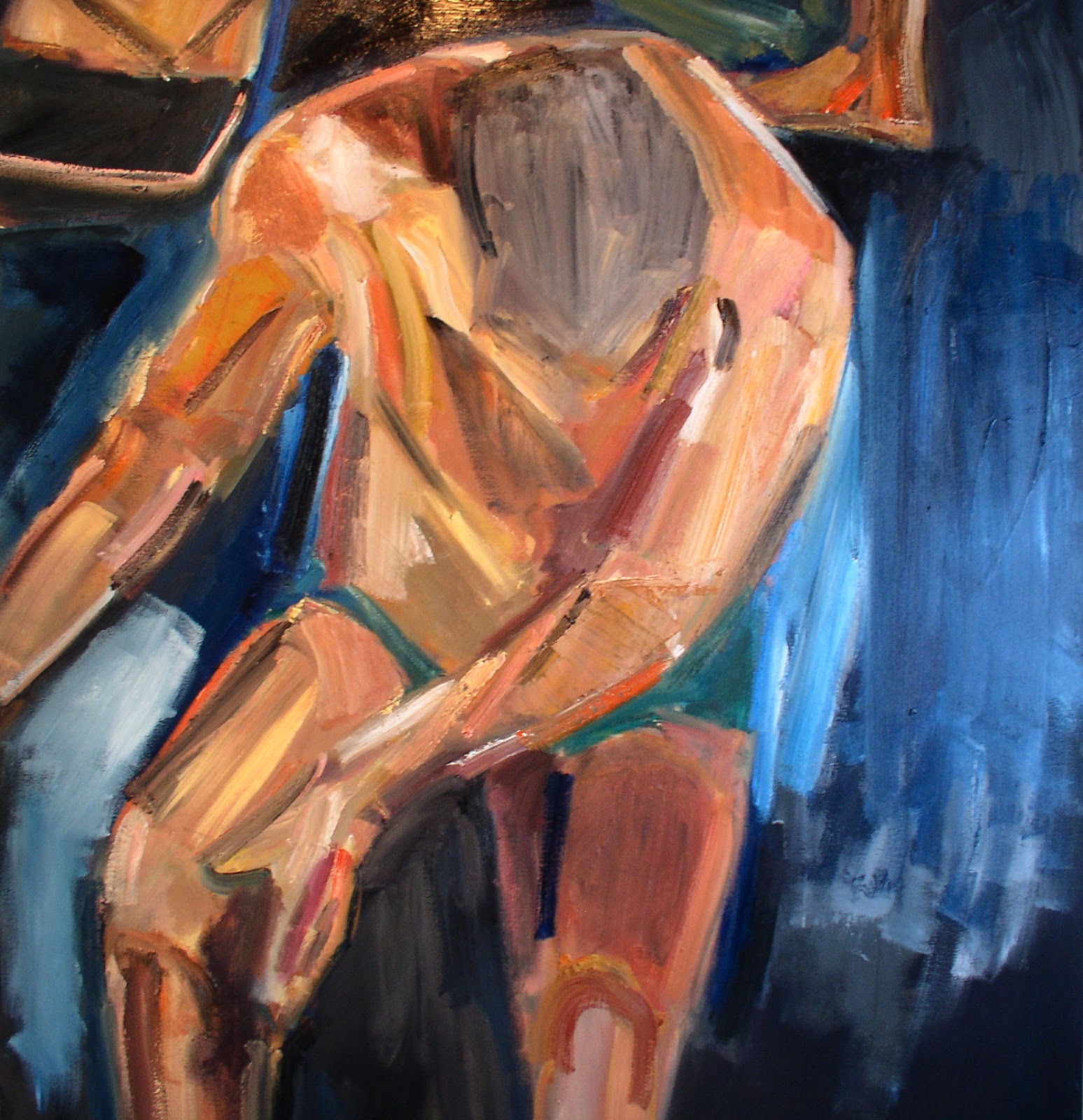

Older Bathers #2-5

 
By version 10, some interesting sections of the painting had been built up, but it still felt like a collection of fragments. What little connection there was between the parts was achieved by alternating color in the contour lines.


Older Bathers #2-10

 
In spite of some pleasing flourishes, version 13 pushed the mechanistic feeling of the painting to the limit. It had become stylized to the point of losing any human connection.


Older Bathers #2-13


 The alternatives seemed pretty clear. I could abandon it and start over from scratch, or scrape it back  and lose a lot of  “good-looking” painting. After I decided these good-looking areas were mostly flash,  I opted to scrape it back.  
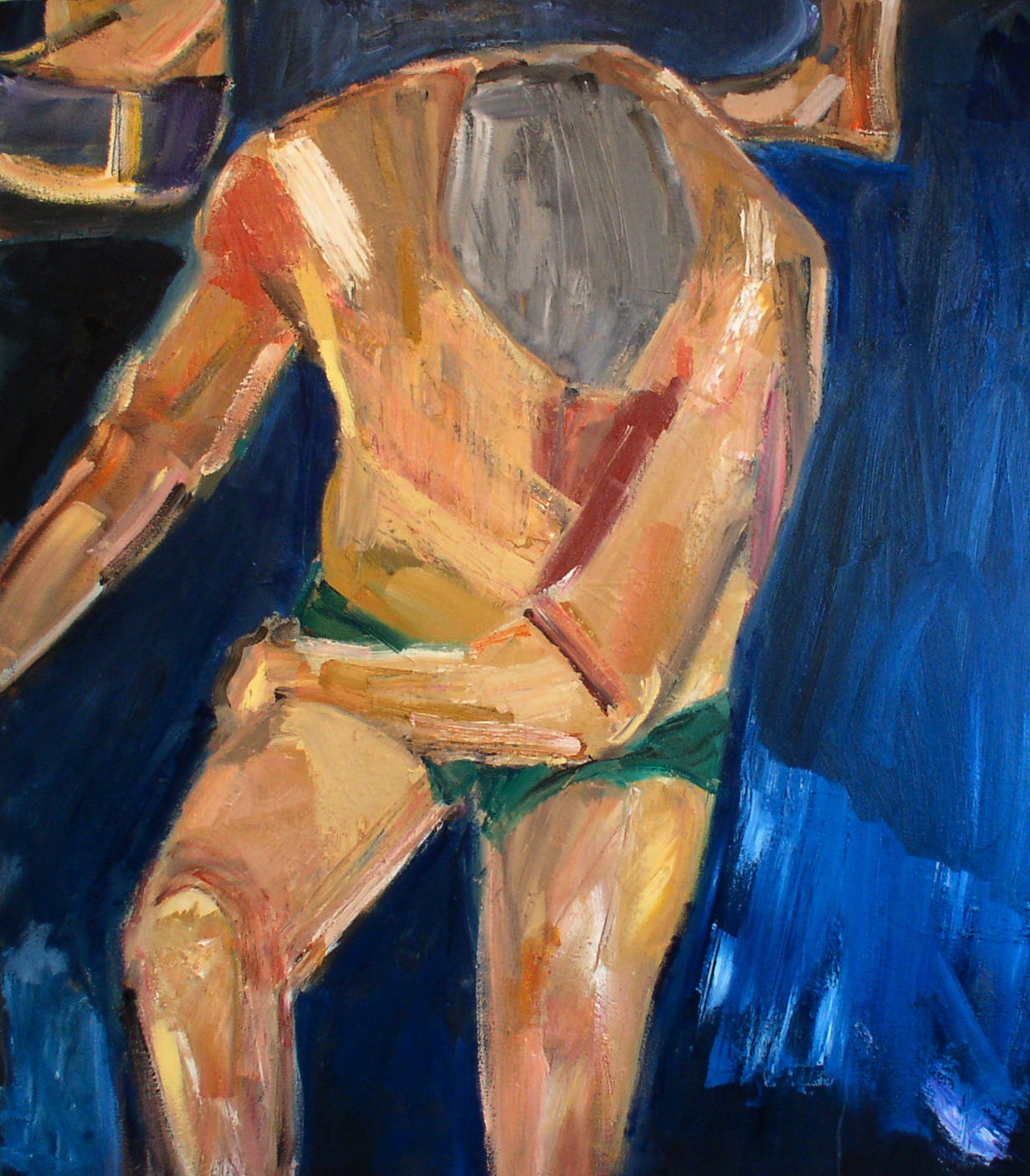


Older Bathers #2-17


Painters tell themselves to be ready to sacrifice any part of the image in order to make the painting stronger as a whole. It isn't an easy guideline to follow, but through the rest of the process, that was my policy.
 
A return to a more humanized form was clear by version 22. I had pared down the painting and at the same time gained back some emotional content. Still, the balance of color and value wasn’t what I wanted, so the search went on.


Older Bathers #2-22


  After more than two dozen variations, this one felt right. Though it wasn't an easy painting (they almost never are), I was finally rewarded by something in the work.  


"Older Bathers #2"-oil on canvas, 54" x 48"


Wednesday, July 31, 2013

SOMETIMES/THE MYSTERIES

 
Writers are often advised to write what they know. We painters make self-portraits and use local light, but even so, we’re most often painting the mysteries.


"Island & Treatment Plant"-acrylic on paper, 8" x 6"

 
The misdirection of perception is a resource for the search. Is that one house or two in the distance? Is that water surrounding skin or skin capturing water— just what does reflection reflect?

"Older Bathers #1"-oil on canvas, 54" x 48"


"Older Bathers #2 (first study)"-colored pencil on paper, 10" x 8"
"Older Bathers #2 (second study)"- pencil on paper, 5" x 4"


 As the poet and painter Blake knew, optics are not enough. What he “saw” were figures lit from inside, and this became his way into (and out of) observational painting.

"After The Conversation"-colored pencil on paper, 10" x8"


"Doreen With Her Cup"-colored pencil on paper, 10" x 8"


There may  be nothing more laudable than getting the hands right, but sometimes misshapen forms and false color ring true, beyond the limits of skill.

Sometimes.

"Doreen In Mark's Garden"-acrylic on wood, 10" x 8"

Sunday, June 30, 2013

"Beach Figure"


I had two sources for this painting: a drawing from the model and a photograph of the pose; the drawing was far and away the more useful. There were a dozen different versions of the painting, which is actually quick work for me. I usually need twice that many sessions to finish a project of this scale. The first painted image was a bare contour, and the linear focus continued throughout the process.


Beach Figure-1


The composition and color were basically set by the third version. Unfortunately, the result was more like a book or magazine illustration than a painting, especially in the flat treatment of the surface.

Beach Figure-3


With a few minor modifications, version 4 could have been a finished painting, but it seemed like a collection of separate shapes rather than a unified whole.


Beach Figure-4


In version 5, there’s a ghostly smile I still take pleasure in, but it was so far away from the feeling of the original pose, I couldn’t let it stand. There are a lot of elements in a painting that I’m happy to change, but I try not to tamper with the emotional foundation.


Beach Figure-5

 
This one was another almost-completed image. I like the contrast between the left and right sides of the face, from clearly delineated features to blurred illegibility.


Beach Figure-8


The final version catches the moody, skeptical quality of the model in the original pose, though the setting is invented and details of the figure have been changed.  The painting also serves as an entry point to summer. 

Since finishing "Beach Figure", I’ve begun working a little differently, concentrating on what I’d call intertwined rather than contrasting color. The results probably won’t look that unfamiliar to anyone who has seen my past paintings. Different times can carry the same sense of light.


"Beach Figure"--oil on canvas,  40" x 40"

Friday, May 31, 2013

Air Brush


"Doreen:White Skirt" acrylic on paper, 13" x 9"


Regardless of the subject matter, I keep trying to paint the same thing: the air between me and the image.


"Doreen: Ochre & Vermilion" acrylic on canvas, 10" x 8"


I don’t want to reduce the distance, I want to make it thicken, to increase the density from the object all the way to my eye---


"Doreen: Chair Pose" acrylic on paper. 13" x 9"


"Mark & Eduardo Paint The Lagoon" acrylic on paper, 13" x 9"


  wherever it resides.


"Doreen: Sun Hat" acrylic on paper, 13" x 9"


"Doreen: Purple Blouse" acrylic on paper,  13" x 9"


It isn’t only in my head, it’s also in my hands.


"Searching The Water"-oil on canvas, 36" x 48"

Wednesday, May 1, 2013

SELF CAMERA


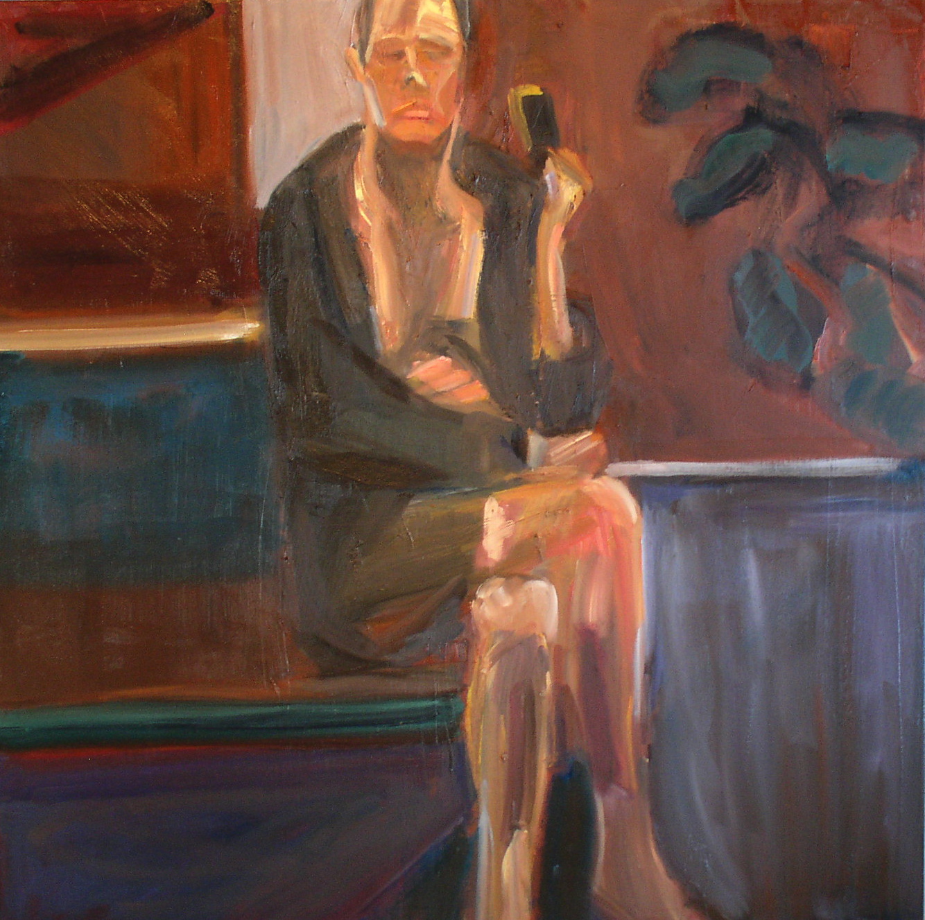
This painting began from a photograph in a mirror. The plant exists, but the room is just a collapsed hybrid of mental and physical space. The only atmosphere here is in the boiling black & red of the wall and the out-of-register light of the face.

In the first version, my goal was to bring each form out of the red background. The basic posture was taken from the photograph, but I did enjoy the dopey English Country Gentleman feeling in the clothes and inclination of the head.


Self Camera-1


By version 2, most of the basic furniture was in place. I did eventually eliminate the window  (an element I tend to overuse). The slanted floor-light, which seemed to call too much attention to itself, was also later replaced.


Self Camera-2


Version 5 was a linear fiesta. The clashing horizontals overpowered the composition and drew the eye away from the figure. The rough comic book rendition of the face did achieve a likeness, but one that felt drawn on the surface instead of formed from the head.


Self Camera-5


Even though I turned down the contrast in version 6, it was still too stiff and rectilinear. By this point, I knew that the rendering wasn’t working. It may have looked like me, but it didn’t feel like me.


Self Camera-6


Version 9 was the key to the final painting. Blurring the mirror image helped me get to a stronger visual equivalent. Clearing away the window centered the focus on the figure. It was a stripped-down composition, but one that was starting to work.


Self Camera-9


Any screen or lens can misrepresent, even the lens of self-image. But a painting like this, based on equal parts experience and invention, is not simply an isolated object. In fact, it’s closer to instrumental music. It’s another extension of continuous time.


"Self Camera"- oil on canvas, 40" x 40"

Sunday, March 31, 2013

The Triangle Pose

 
This painting started with a drawing from the model. During that session photographs were taken, and a second drawing was made from one of them . With these sources in hand, I began the work in paint.

Version 2 is not much more than a crude contour. By version 4, the weight of the pose is clearer as is the emotional distance of the figure. Even so, the color and surface of the painting remain rudimentary.


Triangle Pose-2


Triangle Pose-4


In version 6, most of the compositional elements of the painting are in place. I generally start with a strong color, either in gesso or oil, but this one began with a standard white canvas. For a while I thought I might keep the white dress, but I found it difficult to develop the rest of the color. I was drawn to the bluish-purple here as a better counterpoint to the skin tones.


Triangle Pose-6

 
Version 13  went as far as I could travel into the Land of the Decal. At this point the flatness became claustrophobic.  The surface quality, though actually thicker than it appears in the digital image, seemed slippery-slick. The eye doesn’t find a place to rest in this one and the movement isn’t circular; it’s side-to-side, top-to-bottom and off the edge.


Triangle Pose-13


In order to go forward, an important step back was taken in version 15. I had to undo many of the complicated and unsatisfying solutions I’d come to in #13 and lose what I could have called a finished painting. Some paintings don’t seem to need this kind of sharp U- turn, but here it turned out to be the right choice. 


Triangle Pose-15
  

The final painting includes evidence of all the wrong moves that led up to it. If I did manage to develop a depth of space, it’s in the simplified but still coalescing face. For me, it’s like a sculpture of smoke-- which, as energy-forms, we just might be.


"Triangle Pose"-oil on canvas, 48" x 48"

Thursday, February 28, 2013

"Wade In The Water"


There were eighteen versions of this painting, which is typical for one these larger canvases. In the first session, the mood was subdued & contained in spite of the gestural approach. I don’t usually start from white. I like to under-paint first with a dark or mid-tone to make the open areas easier to work through. Here I skipped that stage and white remained the dominant color for quite some time as the dress.


Wade In The Water-1


Making the leap to yellow was a nod to local color, but it also helped generate some basic structures that form the ground. By version 4 most of the composition is in place and the figure loses its demur quality, taking on a more assertive stance.


Wade In The Water-4


In version 6, I cut down the trees and also some of the value contrasts. The composition was diffuse at this point and the figure had lost its punch, which forced me to spend many days retracing my steps.

Wade In The Water-6


Eventually, I was able to steer the painting back in a  interesting direction.(Reinstating the trees helped). Even so, the figure remained awkward and the cartoon color- combinations were driving me crazy. I like to think of version 11 as “Attack Of The 50-Foot Hairdo.”


Wade In The Water-11


I include version 15 to illustrate how many things you need to change in order to move a painting from “close” to completed.  I’d felt all along that the key to the figure was to let the dress be the skin and the skin the dress, without making them entirely interchangeable. As a guiding principle, this is about as confused as you can get.


Wade In The Water-15


In the final painting, the majority of energy is in the “drapery” of the flesh and fabric, while the preponderance of mystery-- the necessary stillness--remains in the posture and face.


"Wade In The Water"-oil on canvas, 48" x 36"